WALDRON hr redesign.
A human resources consultancy that provides coaching services to help individuals transition careers, and train their clients’ employees to improve leadership skills looks for a new look and feel for their existing website.
the lowdown
-
My role: UX strategy + visual design + information architecture
Timeframe: 2.5 week design sprint
Tools: Sketch + InVision + OptimalWorkshop + Lucidchart
-
Our challenge was to give our client, Waldron, a way to build stronger connections of trust and partnership with users on their initial visit to the website. As it stands, we deduced from our research that the website feels distant and reserved to users when they first land on the website.
-
The ask was to redesign the website in alignment with the brand’s values to invoke feelings of trust between website users and the website itself, which would create a sense of partnership between the users and offered services. In turn, this will allow for more website traffic. We will know this to be true when there is an increase in qualified leads and referrals.
information architecture


Users found a problem with the verbiage in the navigation with phrasing such as “methodologies,” “approaches,” and “our philosophy.” These words felt synonymous to participants which lead them to the conclusion that there is information between these 3 categories that is either redundant or outside of their understanding. Consequently, this verbiage is creating a disconnect between the website and its users. Thus, simplifying the website voice would help users
better understand the navigation without requiring them to do the intellectual labor of dissecting the difference between the three navigation elements
find common ground with the brand, as feelings of connection and partnership are a paramount aspect of a high touch business as well as a stakeholder priority
design studio
with the stakeholders
Our Project Manager, Celine Tjahjadi, was able to set up a Design Studio session with our clients. This allowed us to listen to the stakeholder’s priorities and concerns about the future of Waldron website designs.

with the team
After the initial Design Studio session with stakeholders, my teammates and I conducted a design studio session of our own to highlight what we had learned from the client, as well as a critique all of the designs we could sketch out based on stakeholder input.
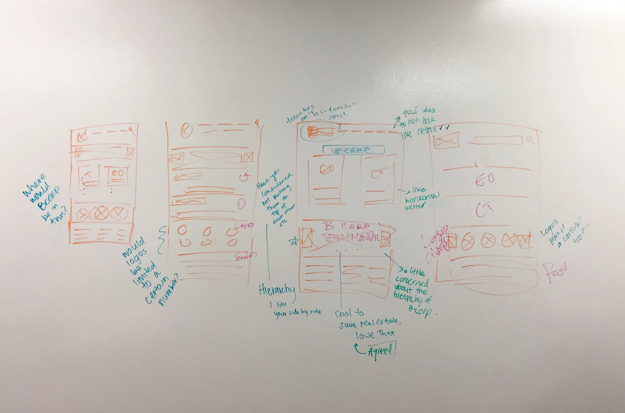
wireframes

Homepage wireframe created by the team’s interaction designer

Contact page created by the team’s interaction designer

“Effective Organization” services page created by the team’s interaction designer
This set of wireframes is the first iteration of wireframes for the home page. During the collaborative design studio, we had a discussion about prioritizing Effective Organization and Career Transition on the home page. Stakeholders additionally expressed the importance of highlighting that they are part of a B Corporation, as well as showing clients’ testimonies to help build trust with new potential clients.
visual exploration
typefaces
Open Sans and Trebuchet are the two typefaces that are in the style guide, that are also appreciated by users. Sectra is not only costly, but users reported in usability testing that it is the one typeface that creates distance, and lacks approachability between the website and website users.


colors
In order to create warmth, and connectedness with users, I did some visual element surveys regarding the color scheme, and some moodboarding activities. The next step was to find colors and text elements that compliment each other and exhibit connectedness with users.
Based on the surveys users preferred the warmer toned colors, which users were able to share that these colors are associated with words that relate to warmth, approachability, and partnership.
high fidelity mockups

First homepage iteration of three total iterations of designs

Final iteration of the homepage after 1 round of usability tests and another round of stakeholder feedback

Changes from stakeholder feedback include adding in “open search” as a primary navigation element as it is the initial click for 70% of the site’s traffic

Final iteration of the “contact Waldron” page

Final design for one of Waldron’s top service offerings: Career Transitions

Final design for one of Waldron’s top service offerings: Effective Organizations
Ultimately, the SUS score of the website went from a score of 72.5 (barely above the minimal usability score) to a solid score of 97 out of 100 possible usability points.
learnings
In retrospect, here are a couple of things I learned from this first-time client/group project:
This first-time group project was an excellent experience in learning how different teammates can all have vastly different work and communication expectations in addition to how important team trust and bonding are in order to better understand and empathize with each individual’s working and collaboration styles.
From a design perspective, I realized after this project that I failed to do as much research and learning on what I had curiosities about. A more thorough discovery phase would’ve offered Waldron an opportunity to convey a more mature design that could have given them a leg up over competitors.
Additionally, as users found much of the verbiage and jargon hard to follow and comprehend, more usability tests and surveys with users would have been in place had we more time on the project to refine and simplify the copy.