ADA’S technical BOOKS redesign.
A desktop redesign concept for a small, Seattle-based business that sells technical books, provides coffee, and a sense of community for technical book readers.
the lowdown
-
A solo design sprint. A school project with options to pick a business, pick a “best-fit” persona based on the business and foreseeable constraints, then create an e-commerce experience for the business based on the persona’s needs.
Timeline: 2 weeks
Platform: Desktop
Tools: Sketch + Figma + InVision
-
Parents who value quality time with their children need a way to effectively and efficiently reserve books for their children who love to read and have quickly evolving interests.
-
By creating an effective book reservation experience for parents of children who love to read and have quickly evolving interests., the design will help to achieve: less returns; reduced frustrations in online shopping for books; and, ultimately, a more pleasant book shopping experience.
the research
The research portion of the sprint consisted of a number of different techniques for a well-rounded perspective around the e-commerce of books: competitive analysis of top competitors such as Barnes & Noble, Half-Price Books, Amazon, among others; affinity mapping was used to synthesize the information that came out of a card sort done with participants who are parents of tween children:

In speaking directly with usability interviewees, I found some major stats that stood out from the rest:
100% of parents get excited about new inventory which helps them shop for their children
100% of users felt frustrated while attempting to navigate the site
80% of users felt a lost sense of purpose on the site due to their frustrations
100% of users left the site without success in finding a book or activity for their child
the average user — meet john
John is Ada’s average online experience user:
He loves fresh inventory
Prefers detail product descriptions
Loves to read through and explore product ratings and reviews
Has a 12y/o daughter with quickly evolving interests who he loves spending time with
Primarily uses desktop to shop around for gifts online
Some of John’s frustrations with Ada’s online experience include
Difficulty understanding how to navigate to find something for his 12y/o daughter
Feeling a lost sense of purpose on the site after a tedious, unsuccessful search
Lack of inspiration for gift shopping for his daughter or activities they could do together

the ideation process
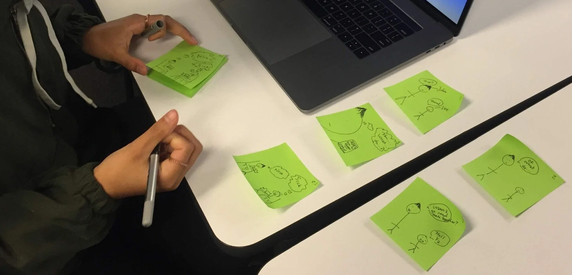
Example of what storyboarding looks like in action
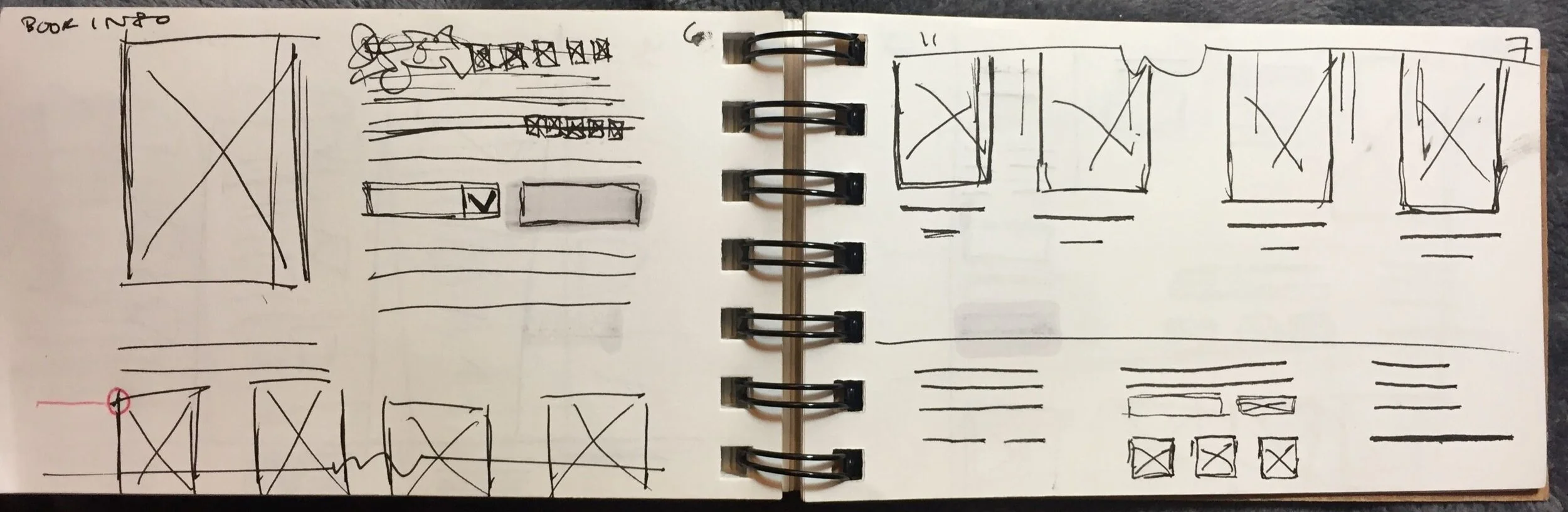
Example of sketches for product detail pages
Sketching and storyboarding allow me to think through the ada’s experience with empathy for the user’s touch points and choices while trying to complete the task, without committing to any pixel-perfect wires or designs digitally.
Ultimately, these storyboards and sketches helped me see through problem areas on Ada’s site, then ideate through all three iterations of what would end up becoming wireframes.
the wireframes
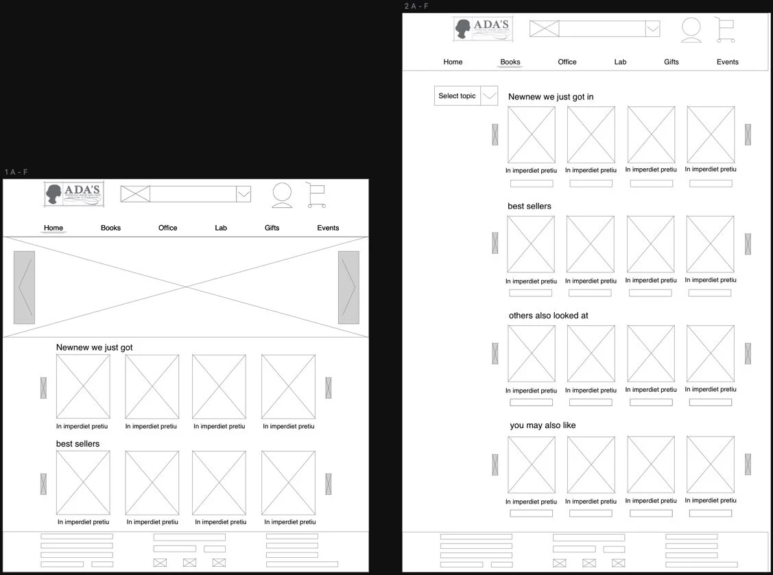
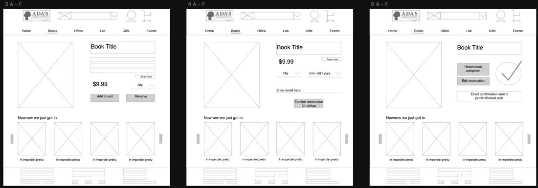
After three iterations, the wires finally boiled down to
A condensed flow with a stronger structure and a more natural site flow involving less clicks and fluffy content along the way.
Preservation of real estate with a consolidated selection menu for book genres and categories instead of a cluttered side bar on the search page.
Receiving an email confirmation upon item reservation to reassure the user that their items are, in fact, reserved.
the homepage mockup

The final homepage mockup shows use a monospace typeface to convey the technical aspect of Ada’s, but also the display of welcome, warm, and community aspect of Ada’s with the lighter, warmer peach tones.
learnings
In retrospect, there are a few major things I learned from this solo project:
Scoping a project at the beginning will save tons of time and resources later. Starting a project with an understanding (even if brief) of how much work will be required and all the ground that one will be covering is crucial to understand the timing, efforts, and bigger picture.
Organizing and prioritizing all of the different stages of design, then having a clear idea of which sections will take priority if and when hurdles arise.
How much a designer gets out of usability testing is equal to the amount that they put into a design before they begin testing: my low-fidelity wires were so high-level that the feedback felt minimal and the changes felt piecemeal. I hadn’t invested quite as much into the wires in order to receive the loads of feedback that I had originally been hoping for, perhaps as much as I could have received with higher fidelity wires.